How many Teams do you have? Let me draw you a map
Your Teams Architecture isn’t a list—it’s an unexplored landscape, worth exploring
Fire up the Admin Center and there they are: clean rows of team names, all accounted for. Problem solved... or is it?
When your tenant is growing, looking at rows of team group names, might just not be the best way to access this information. Especially, when this Information might be valuable not only for IT Admins, but also for Management and even Endusers. So let’s take this list and draw a living map of how collaboration really happens on your tenant.
“Let me introduce to you, the Service that fuels Copilots Semantic Layer, the often underestimated, hidden Library that stores alle M365 Activity: Ms Graph)”
Problem Statement
You can’t govern what you can’t see.
Admin dashboards give you lists, not landscapes. Without visibility, you’re flying blind—not just for IT governance, but for organizational strategy.
Why does this matter? Because your Teams structure isn’t an org chart—it’s a slice of real-world collaboration. It shows how work actually happens: who talks to whom, where projects thrive, and where they die.
Overview is power.
With the right filters and a digital telescope, you can spot deserts (inactive teams hoarding files) and thriving hubs (cross-functional collaboration).
You can tackle guest governance by identifying clusters with external access and improving security without killing agility.
You can inform strategic decisions:
Where to consolidate teams
Which departments collaborate (or don’t)
How to design lifecycle policies that fit your culture
In short: making the big picture visible leads to better decisions—for IT, for management, and for organizational development.
Pitch for Solution
Query the Teams Intelligence from Graph -> Let an LLM Map it according to your needs into an hmtl-based Visualisation Template = Enjoy the view
Meet Your Organizational Intelligence Service: Microsoft Graph
Before we start mapping, let's appreciate what we're working with. Microsoft Graph is essentially the intelligence archive of your M365 tenant—every Teams message, file share, meeting invite, and collaboration creates a data point. Graph stores the who, what, when, and where of how work actually happens.
Think of it as your organization's collaboration archaeology. While Admin Center shows you the current snapshot ("here are your teams"), Graph holds the full story: creation dates, activity patterns, member changes, guest interactions, file activity. It's the difference between a phone book and a social network analysis.
Let’s be thankful for Microsoft's PowerShell obsession.
Here's where it gets beautifully nerdy—Microsoft has made virtually everything PowerShell accessible. Need to find teams with no recent posts? Need to see which teams share the same owners? Curious about file storage patterns? Graph's got you covered and PowerShell can pull it in minutes.
It's like Microsoft handed you professional-grade surveying equipment and said "go explore your tenant." The raw intelligence is there; you just need to know how to ask for it.
So for the Teams group landscape, let’s start with something like this:
Disclaimer: I'm more power than shell, so to all the PowerShell OGs out there - excuse my humble attempt, testing possibilities are limited. Please make it better. Full script + improvements welcome at [github.com/achimimboden/teams-landscape-scanner]
$microsoftTeams = @()
$groups = Get-MgGroup -Filter "resourceProvisioningOptions/Any(x:x eq 'Team')" -All
foreach ($group in $groups) {
$owners = Get-MgGroupOwner -GroupId $group.Id
$members = Get-MgGroupMember -GroupId $group.Id
$channels = Get-MgTeamChannel -TeamId $group.Id
# Governance intelligence gathering
$governanceFlags = @()
if ($owners.Count -eq 1) { $governanceFlags += "Single Owner Risk" }
if ($group.RenewedDateTime -lt (Get-Date).AddMonths(-6)) {
$governanceFlags += "Ghost Town Alert"
}
$teamData = [PSCustomObject]@{
name = $group.DisplayName
owners = $owners.DisplayName -join ", "
memberCount = $members.Count
channels = $channels.DisplayName -join ", "
governanceFlags = $governanceFlags -join ", "
}
$microsoftTeams += $teamData
}
# Export for AI map-making
$microsoftTeams | ConvertTo-Json -Depth 3 | Out-File "retro_microsoft_teams.json"
Pro tip: Maybe your team architecture is so out of whack and has no guardrails of nomenclature that for an LLM it's hard to map organizational structure. So what I sometimes do: cross-reference team owner roles with company role functions in an organizational database, to give the LLM a little help.
Your HR system knows who reports to whom. Your Teams data knows who owns what. Cross-referencing these datasets helps the LLM understand that "Sarah.Marketing" and "Marketing.Q1.Campaign" both belong to the Marketing cluster, even when naming conventions are chaos.
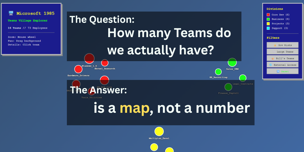
The First Expedition: Mapping Retro Microsoft
Before we explore your real tenant, let's take a practice run with in a fictional landscape. Picture Microsoft circa 1985—about 75 employees, Bill's garage energy, but real business pressure. If Teams had existed back then, what would their collaboration map have revealed?
The Raw Intel (What Graph Would Have Revealed):
Functional Teams:
Dev_MS-DOS → Owners: Bill Gates, Paul Allen → 8 members → Channels: General, Kernel, BugFixes → ⚠️ IBM guests in confidential channels
Project_BASIC → Owner: Bill Gates → 4 members → ⚠️ Single owner risk
Windows_1.0_Launch → Owner: Steve Ballmer → 12 members → ⚠️ Naming chaos (also exists: "WinLaunch", "WindowsProject")
Support Teams:
Finance_Payroll → Owner: Melinda French → 3 members → ⚠️ Sensitive files in public channels
Marketing_1984_Campaign → Owner: Steve Ballmer → 6 members → ⚠️ Ghost town (campaign ended, still active)
Wild Cards:
GarageFun → Owner: Paul Allen → 15 members → ⚠️ Private channel with IBM guest access
The Map Reveals the Story: Even at 75 people, governance blind spots were already forming. Bill as single owner on critical projects, IBM guests wandering into private channels, ghost teams accumulating files. Classic Frontier Village patterns—everyone knows everyone, but information flow is breaking down.
Drawing the map
This part feels almost self-explanatory: take your Graph API JSON, feed it to an LLM, and say "make an interactive HTML visual." But depending on your LLM - not all of them are as great as Claude in web design - we will need a little template for inspiration, how this can look like. This visualization uses D3.js force-directed layout to naturally cluster teams by organizational function. Each bubble represents a team, sized by member count, color-coded by division. The Bubbles are clickable for governance metadata: owners, team size, division, specific issues. With Interactive Filtering, the filter buttons transform static visualization into organizational intelligence.
⚠️ Gov Risks → Instantly highlights teams with ownership gaps, security issues
👑 Bill's Teams → Shows concentration risk (spoiler: Bill owns everything)
🌐 External Access → Maps guest access patterns across departments
📏 Large Teams → Identifies scaling bottlenecks
[Interactive Retro Microsoft 1985 Teams Village - Click for Download]
Pro tip: Maybe your team architecture is so out of whack and has no guardrails of nomenclature that for an LLM it's hard to map organizational structure. So what I sometimes do: cross-reference team owner roles with company role functions in an organizational database, to give the LLM a little help.
Your HR system knows who reports to whom. Your Teams data knows who owns what. Cross-referencing these datasets helps the LLM understand that "Sarah.Marketing" and "Marketing.Q1.Campaign" both belong to the Marketing cluster, even when naming conventions are chaos.
Why Filtering Matters - The Treasure Map
Without filters, you see the overall landscape. With filters, patterns emerge. It's the difference between a static map and interactive organizational archaeology. You're not just viewing data—you're exploring collaboration reality.
Governance risks cluster in specific departments
Ownership concentration becomes visually obvious
External collaboration patterns reveal security gaps
Team size distribution shows scaling problems
It's the difference between a static map and interactive organizational archaeology. You're not just viewing data—you're exploring collaboration reality.
Version 1.1: Treasure Map for CISOs and IT Admins
So drawing the landscape is one thing, but filtering makes it great. Now let's turn this into a treasure map for CISOs and IT Admins.
The CISO Hunter's View
Let’s add some filter and adjust the View:
Red Zone (Ownership Risk) → Teams with single owners, concentration gaps
Orange Zone (Security Risk) → External guest access in sensitive areas
Purple Zone (Ghost Teams) → Inactive but storing files (compliance nightmares)
Pink Zone (Data Exposure) → Sensitive information in public channel
Click the "⚠️ Problem Analysis" tab in the visualization. Watch the transformation: 16 teams become 10 risk-focused clusters. Healthy teams disappear. Problem teams reorganize by risk category instead of department structure.
What you lose: Organizational chart thinking. No more "let's check the Finance team." Now it's "let's hunt the ownership gaps."
Beyond Governance: Other Filtering Scenarios
The same visualization framework works for other organizational intelligence:
🤝 Collaboration Scenarios
Cross-department bridges → Teams with >30% external department members
Innovation hubs → High file creation, diverse membership
Communication bottlenecks → Large teams with single channels
📊 Growth Pattern Analysis
Rapid expansion alerts → Teams growing >50% in 90 days
Scaling stress points → Teams approaching platform limits
Merger integration tracking → Mixed organizational heritage patterns
💰 Cost Intelligence
Storage hotspots → File hoarding vs. activity ratios
License optimization → Guest-to-member ratios by team
Unused capacity → Ghost teams consuming resources
Version 1.0: Pretty organizational chart with some filters
Version 1.1: Risk-focused intelligence with actionable clustering
Version 2.0? Real-time alerting when patterns shift, predictive governance recommendations
The deeper insight: Your collaboration architecture isn't just IT infrastructure—it's organizational DNA made visible. The right filters don't just show you what exists; they reveal what needs attention, what's working, and what's breaking before it becomes a crisis.
Beyond the Retro: Apple-Inspired Control Center
Not everybody is a fan of Win 95 aesthetics, and Bill doesn't need this much attention. So let's quickly bring this into the now, with a slick design and up-to-date example, so you can actually use this.
The Inevitable Questions
After seeing Graph API data transform into organizational intelligence through simple LLM translation, two questions always emerge:
Question 1: How, in the world, is this not a feature in Entra?
Seriously. Microsoft has:
✅ Graph API with all the collaboration data
✅ Power BI for visualization capabilities
✅ Copilot Studio for AI-powered analysis
✅ Entra admin center for governance tools
Yet somehow, the best way to understand your Teams landscape is still... endless spreadsheet exports and manual analysis?
Microsoft gives you the raw materials for organizational archaeology, then hands you a shovel when you need an excavator. The intelligence is there. The tools exist. The Gap? Someone to connect the dots. @Microsoft: *wink *wink*
Your move, Redmond. 👀
Question 2: How do I make this actually work in production?
The demos are pretty, but let's be honest - hardcoded JSON files don't cut it in the real world. You need:
Daily data updates (teams change constantly)
SharePoint integration (where people actually work)
No manual maintenance (because who has time?)
So one could: SharePoint List → Power Automate → Graph API → Live Visualization
Monday 6 AM: Power Automate queries Graph API
→ Updates SharePoint List with latest team data
→ Your visualization auto-refreshes with current reality
Question 3: But does it scale?
Ah, the question that makes every IT architect's eye twitch.
Sure, the visualization looks great with 18 teams from Nexus AI. But what about enterprise reality?
What happens at 1,800 teams?
18,000 users?
Multiple tenants across acquisitions?
What about real-time updates when teams change hourly? Performance with massive Graph API calls? Visualization complexity when you can't see individual bubbles anymore?
I guess we'll find out together in the next blog post.
Until then, I wish you all good exploring in your Teams landscape. May you find hidden treasures, uncover forgotten collaborations, and discover that your organizational DNA is far more interesting than any admin center list could ever reveal.
Happy hunting! 🗺️⛏️